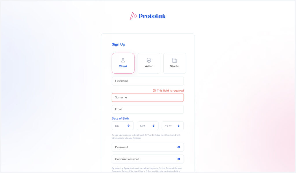
an app designed to solve tattoo concerns
I thought and crafted Protoink to solve three main problems in the tattoo market: lack of hygiene, social exclusion, and sexual harassment. I’ve also taken the opportunity to learn a bit more about coding, hence I could assist developers whilst speaking their language.
Role: CEO, UX, UI, Front-end
Native React App, Web App
PROBLEMATIZATION
Lack of Hygiene
Due to disinformation about before and after tattoo sessions, many people end up having their tattoos inflamed. The risks are massive and easily scalable.

“1 out of 5 people with a tattoo experienced infectious difficulties after being tattooed.”
(NCBI 2016)
Social Exclusion
Signs of racism is present in many studios nowadays. Just look up any artist portfolio, and you will see that at least 90% of the shots were applied on white skin.

“A tattoo artist denied to continue the procedure cause my skin was thicker”
(Cosmopolitan 2020)
Sexual Harassment
Recently the number of sexual assaults, inappropriate behaviour and abuse has been increasing in tattoo studios worldwide, including customers and co-workers.

“He groped his palm on top of my underwear and just started tattooing.”
(Blackmoontattoos 2021)
SOLUTION
Why an application though?
Once I had laid out the core problems that are still present in the 21st-century tattoo industry, I threw at the table the possible experiments I could run in order to solve these problems such as an informative website, instructional leaflets or even social campaigns.
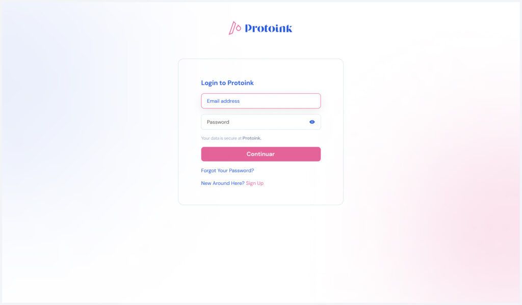
However, none of these above options ensured a candid filtering process, substracting potential harmful studios or artists, or even bad-actor clients. Having control over the flow from signing up, to exploring and booking, Protoink would make sure to be a safe place for anyone who wishes to get inked.
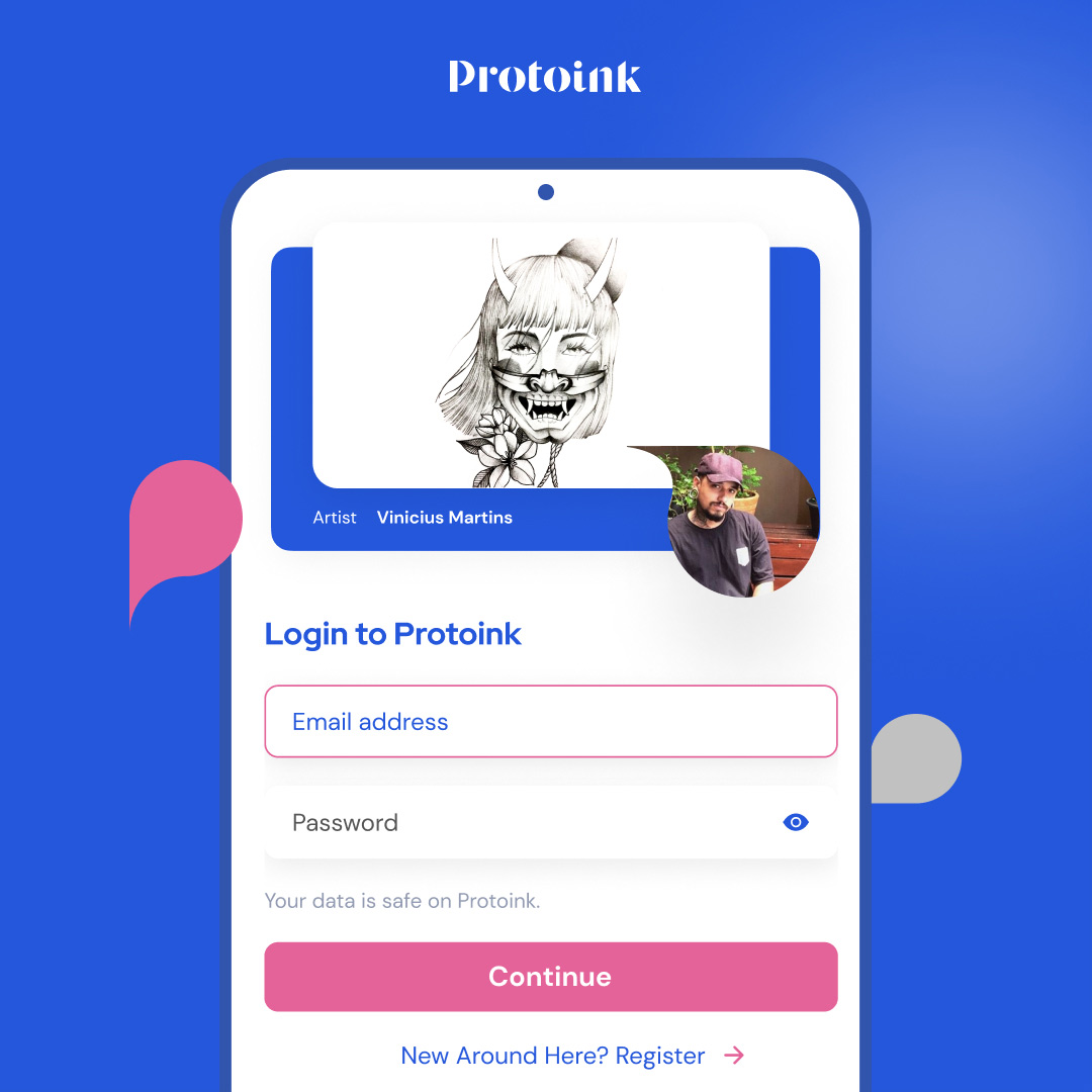
Steps to achieve that:
-
Research
-
Planning
-
Explore & Define
-
Prototype
-
Front-end
Techniques used:
-
Double-Diamond
-
Heuristic Evaluation
-
Priority Matrix & WSFJ
-
“How Might We”
-
Face-to-Face Workshops
RESEARCH
Competitors
Without a doubt, Tattoodo would be Protoink’s biggest direct competitor due to its time on the market and its available functions. However, compared to Protoink’s main value propositions, we see that we have space and opportunity to stand out and expand.

✕ Gender Inclusion
✕ Ethics Guidelines
✕ Regulations and Approvals
✕ Anamnesis sheet
✓ Post Ideas
✕ Chatbot
✓ Booking
✓ Payments
✓ Rating system
✕ Gender Inclusion
✕ Ethics Guidelines
✕ Regulations and Approvals
✕ Anamnesis sheet
✓ Post Ideas
✕ Chatbot
✓ Booking
✓ Payments
✓ Rating system
✕ Gender Inclusion
✕ Ethics Guidelines
✕ Regulations and Approvals
✕ Anamnesis sheet
✓ Post Ideas
✕ Chatbot
✓ Booking
✓ Payments
✓ Rating system
Pain Points
Cost over Value
Tattoodo is the only app that brings a rating system, though it’s way too expensive for small tattoo shops and beginner artists.
Lack of Regularization & Instruction
None product currently in the market raises the attention to the importance of hygiene procedures and harassment demolishment.
PLANNING
Assumptions
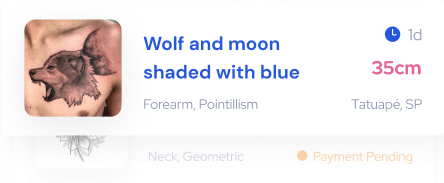
Idea first
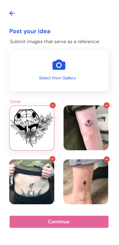
The clients would like to post their ideas before looking for ideas posted by studios and artists or learning about tattoo care.
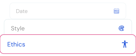
Filter by Ethics
Based on a research made with a few friends, users would prefer to explore and pick the studio which will match their ethical values.
3 Birds, 1 Stone
By solving our primary customer problems -the client-, we will also solve day-to-day problems for studios and artists.
Approach
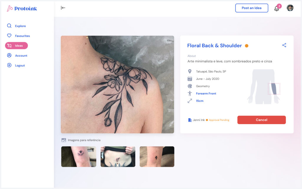
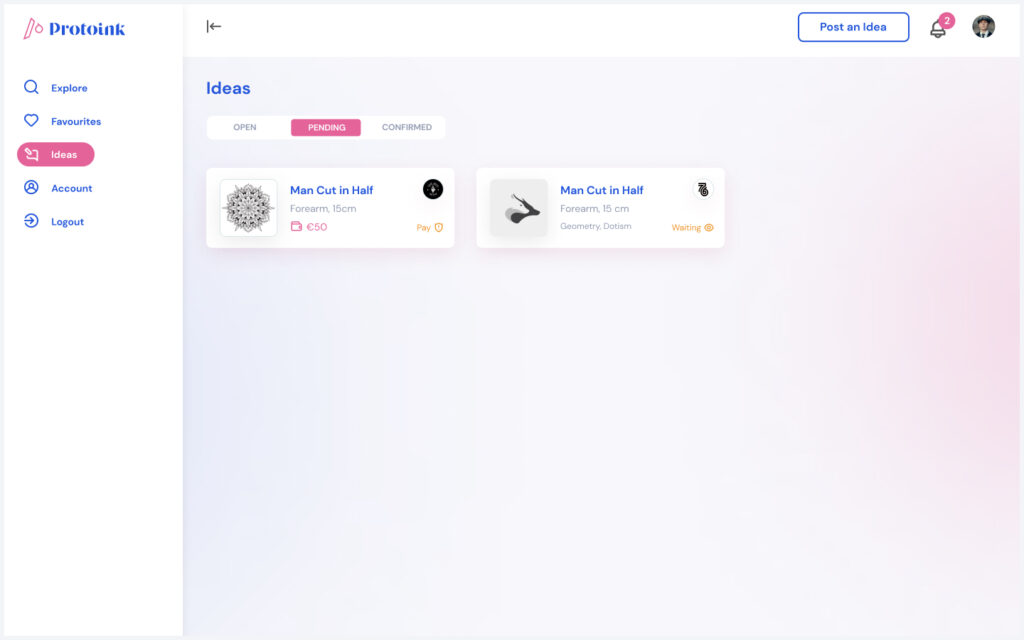
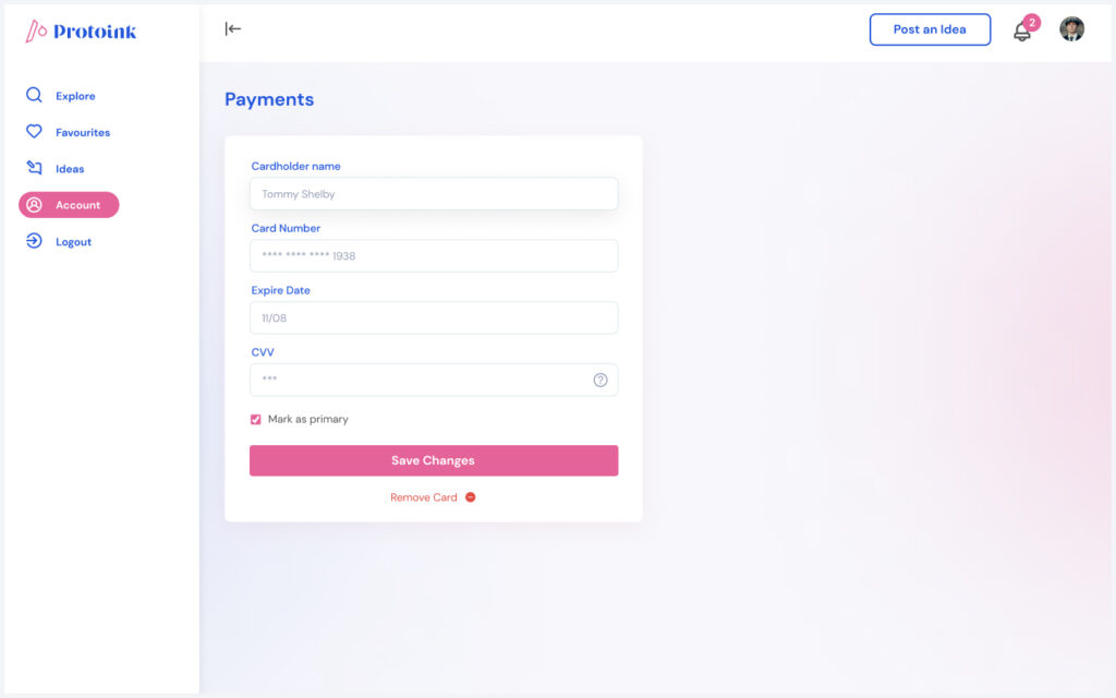
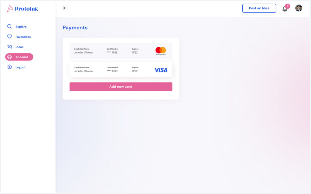
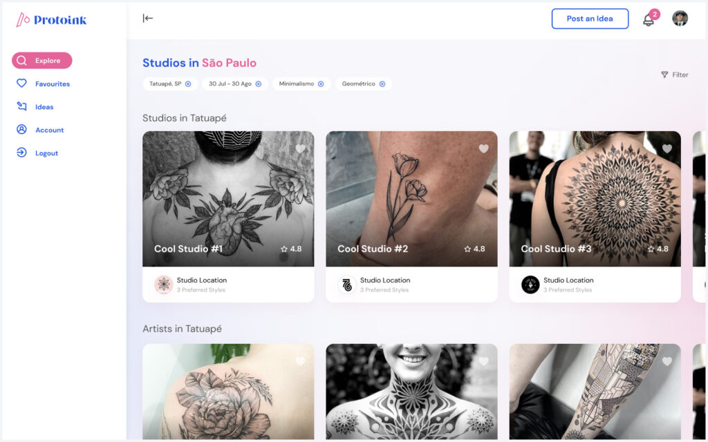
Protoink represents a new and secure way for users to connect and position themselves in the same ecosystem digitally. Furthermore, we aim to empower individuals to take control of their tattoo planning, booking and execution.
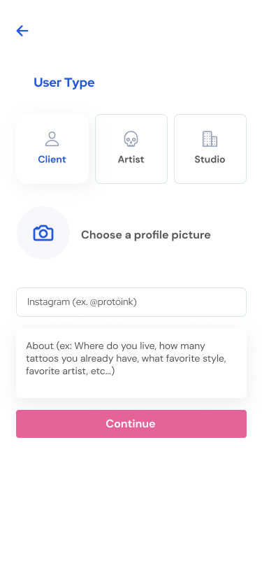
Three types of users: Client, Artists and Studios.
User Goals
Client
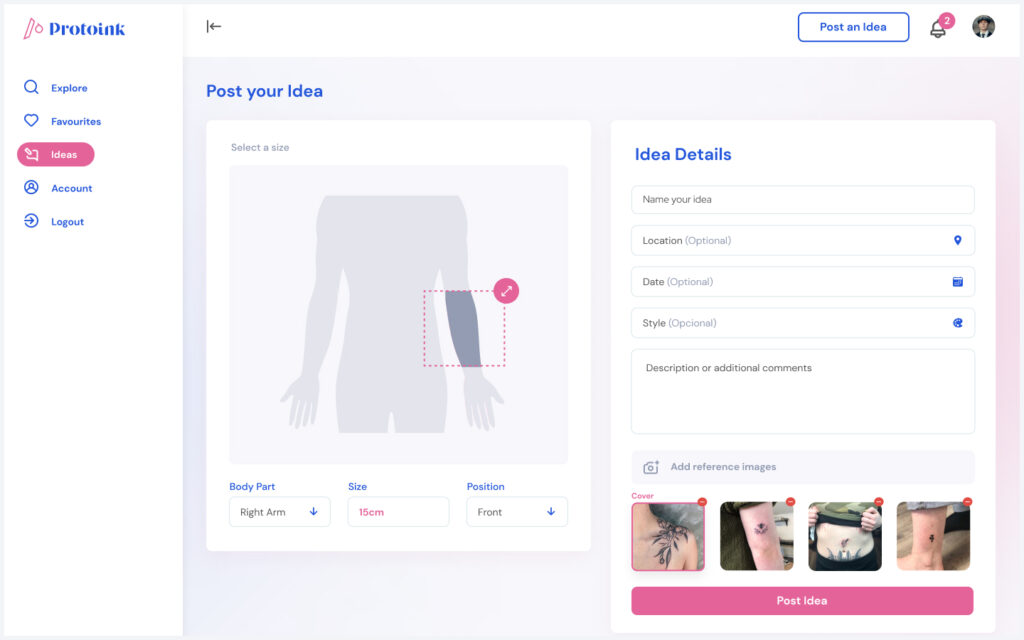
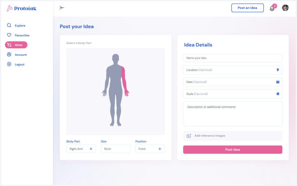
Post/Find ideas
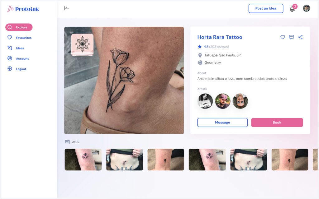
Find Studios/Artists
Send/Receive Idea Offers
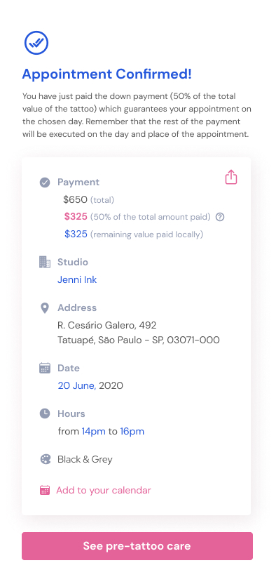
Book & Pay
Anamnese Form
Educational Tests
Artist
Post/Find ideas
Find Clients/Artists
Send/Receive Idea Offers
Send/Receive Job Offers
Be part of a Studio
Hygiene & Educational Tests
Studio
Post/Find ideas
Find Artists/Artists
Send/Receive Idea Offers
Send/Receive Job Offers
Hira/Fire an Artist
Hygiene & Educational Tests
User Stories & Flows
As a client, I would like to securely post ideas, find great studios, book and pay.
As an artist or studio, I would like to receive ideas, offer ideas and book.
EXPLORE
Brainstorming
Collaborative Decisions
While structuring elements such as branding, information architecture, design system and interactions, collaboration with other human beings was crucial. Most core layouts were handcrafted first on paper in group sessions and refined by me at the high-fidelity version.
Constraints
Aiming to build a desired product that includes race, gender, class and sexual orientation, the most challenging constraint is to keep it simple yet significant.
Although we wanted to scream to the minorities: “Come here, there’s a place for you”, we knew we couldn’t simply close our eyes to the majority.
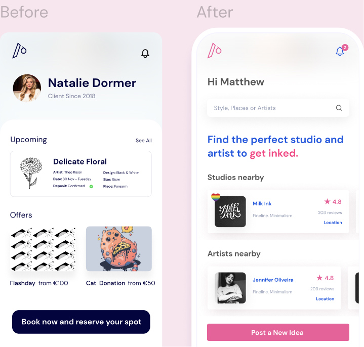
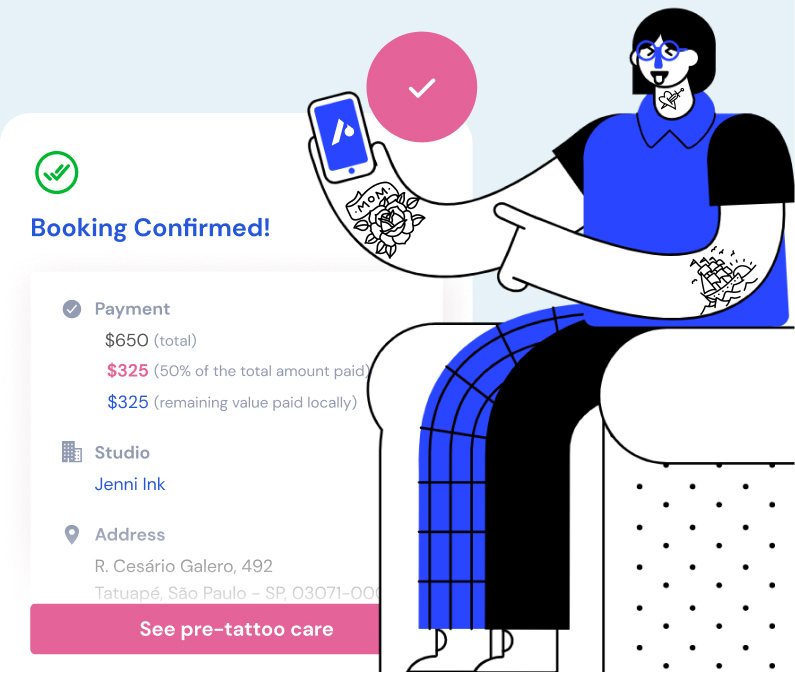
Trade-offs
The business model initially brainstormed was similar to the competitors out there.
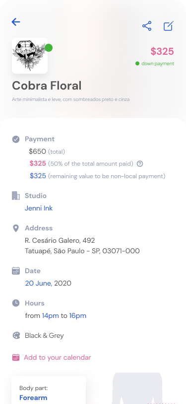
Then, we decided to reduce the subscription price for artists and studios to make the app available for all social classes and centralize the monetization charging a higher fee upon appointment.
DEFINE
Atomic & Consistent Components
In order to do that, I had to step back and set all necessary components I would use, based on sketches I’ve made throughout the brainstorming process. States, variations and error handling were also added to this library.
Protoink Design Token
Protoink Design System
Global Navigation Framework
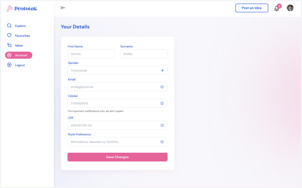
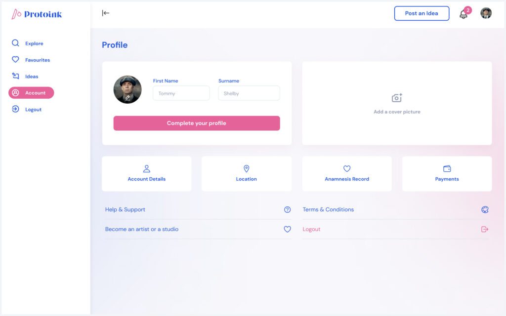
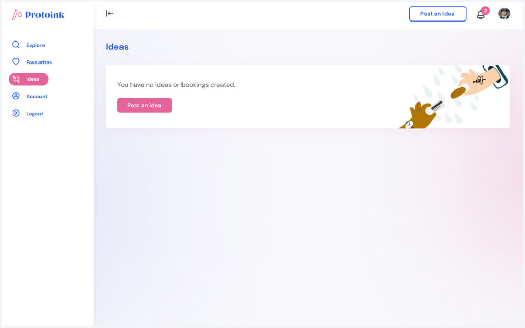
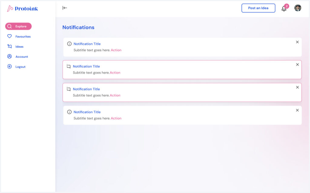
Focusing on simplicity and clarity with unique interaction details, the main navigation elements were set by me using variant systems.
PROTOTYPE
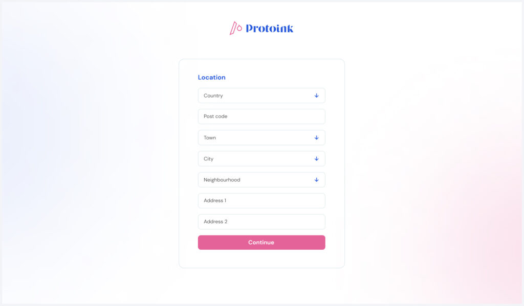
A +100 Screens Production With A Mobile-Driven Approach
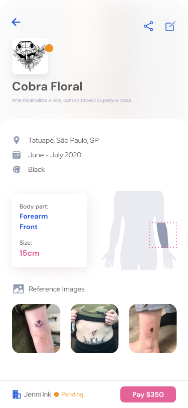
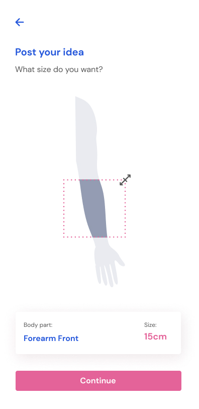
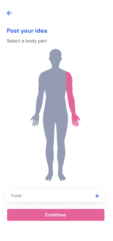
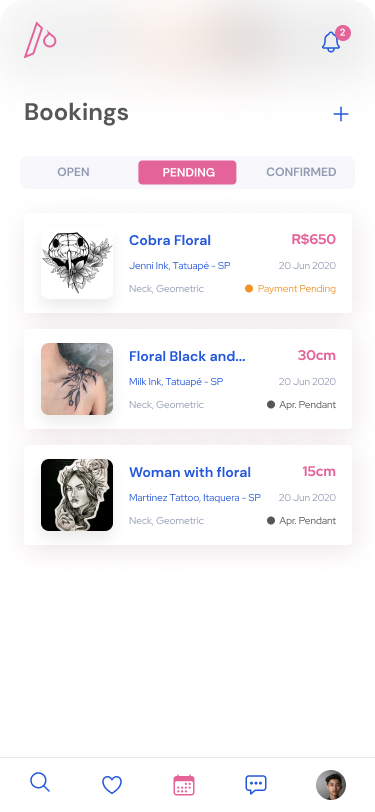
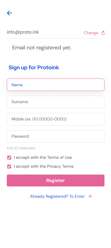
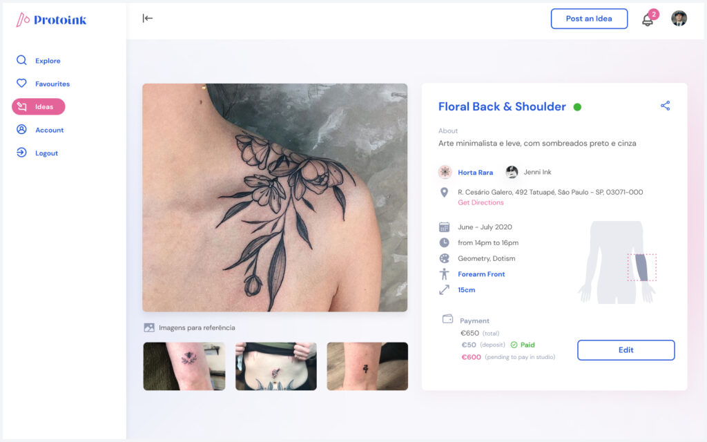
We created the app with a small device strategy, enabling us to simplify solutions before scaling them up for larger devices.
HIGHLIGHTS
Evaluation
When registering, the studios will go through an Higyene Evaluation Process for the place, the materials’ components and their expiration date, correct use of masks, gloves, protective equipment and, finally, following all mandatory rules of the Government to keep your tattoo parlour in good working order.
Anamnesis
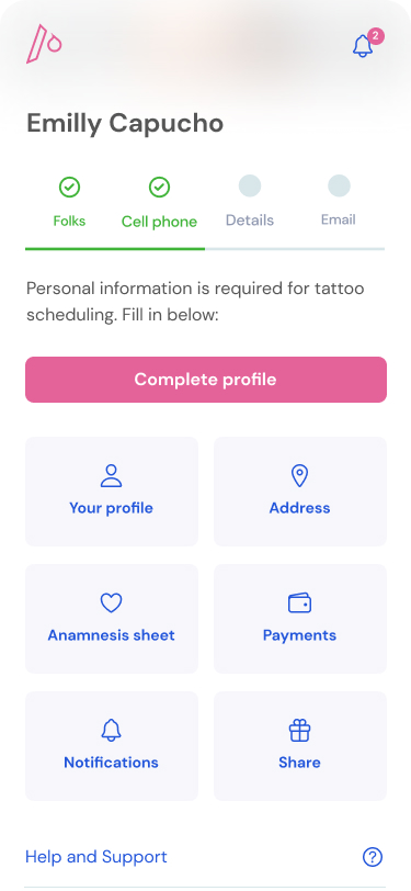
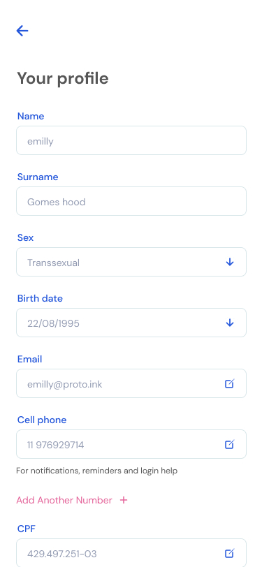
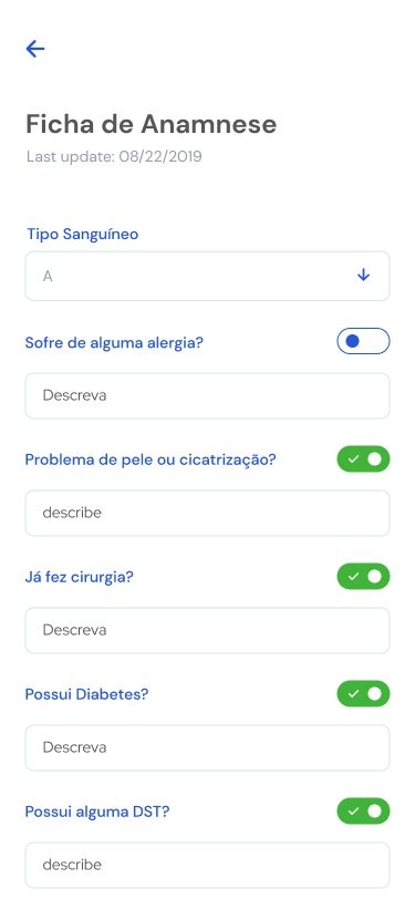
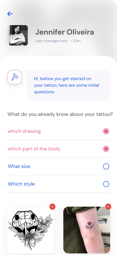
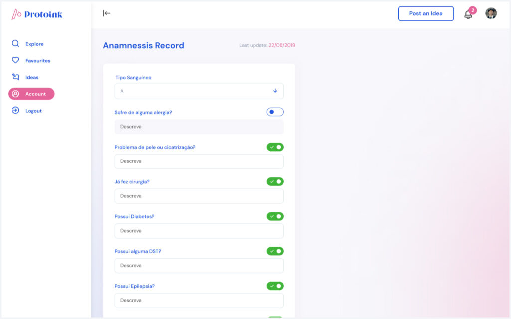
Before booking a tattoo, clients must complete the Anamnesis Form, one of the rules given by the Government and frequently ignored by tattoo parlours worldwide. Also, we will make available pre and post-care booklets with reliable sources coming directly from health professionals.
Inclusion
Studios and artists can choose which Inclusion Stamps will be available on their profiles. There will also be a test with questions referring to the selected topic to encourage deep learning about the subject.
Preferences
By embracing a cause, we believe that studios and artists become responsible for their attitudes towards situations that demand respect, education, and understanding when relating to their clients.
Orientation
We will also provide informational booklets for tattoo artists and clients to educate and give tips on preparing, applying, and promoting tattoos without harassing or offending your clients.
Transparency
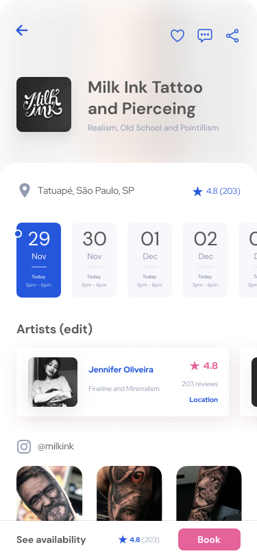
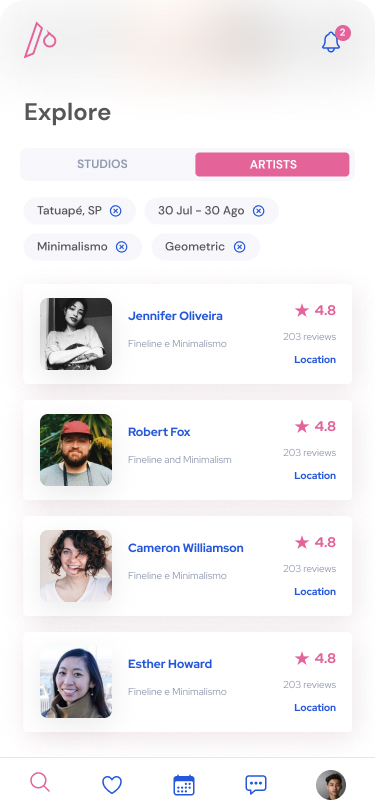
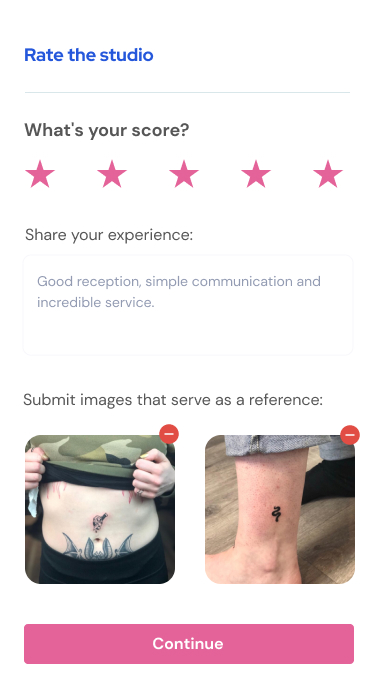
Each profile will highlight user ratings to easily filter out professionals who can offer a high-quality experience to anyone and expose unqualified tattoo artists.
A Design System Made To Scale
Providing a focused and effortless experience.
FRONT-END
From Design to Code
A designer who understands coding boundaries and foundations can always go further when crafting a digital product. Given the challenge to learn how to set up a proper project structure and how to code using React Native Js, design code was my choice for React courses made from designers to designers.
Expo as Renderer
As I didn’t have much knowledge regarding how to simluate the code I would be writing, I searched for a easy-setup framework to help me out and Expo worked smoothly.
Contentful for Content Management
Again, trying to find ways to minimize coding-related tasks, I’ve used Content API as the headless CMS, using Apollo GraphQL to display it.
Firebase as an Authenticator
Connecting Firebase API wasn’t an easy task, but after spending a few days pulling my hairs, I overcame this insane challenge for a mere designer.
Organizing files & folders
Again, trying to find ways to minimize coding-related tasks, I’ve used Content API as the headless CMS, using Apollo GraphQL to display it.
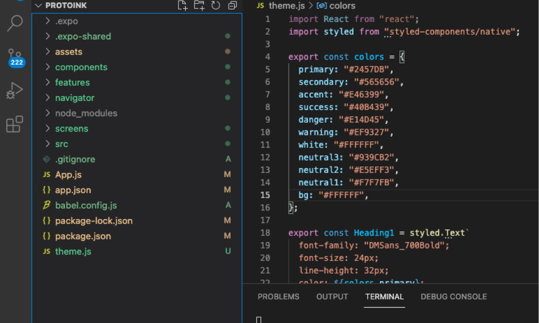
Theme file based on color system
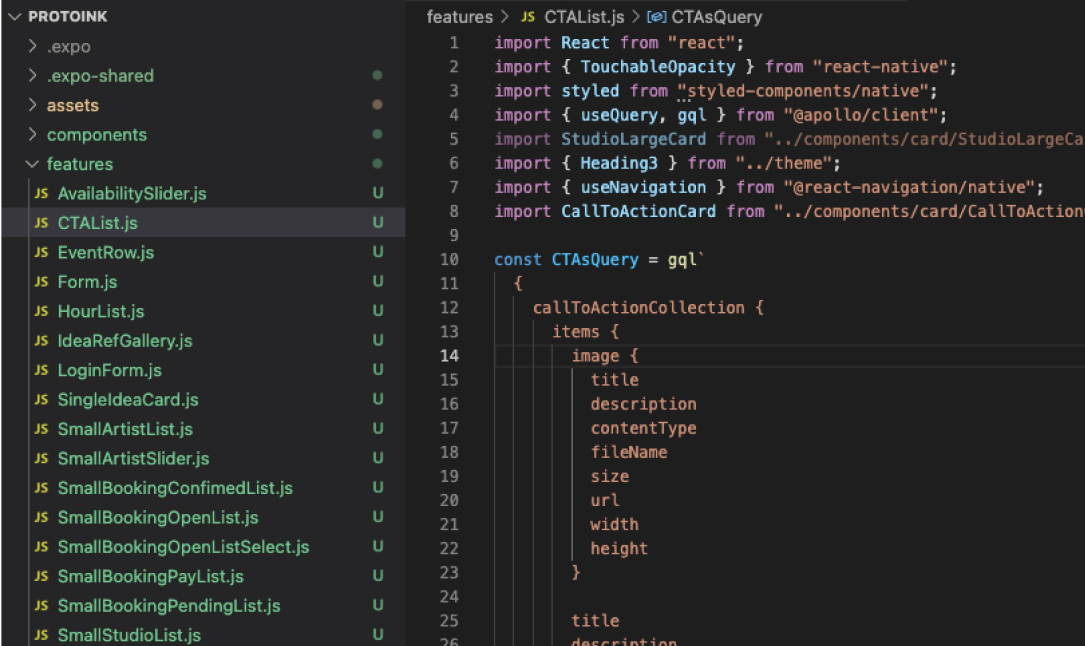
Array list fetching data from API and displaying with GraphQL.
